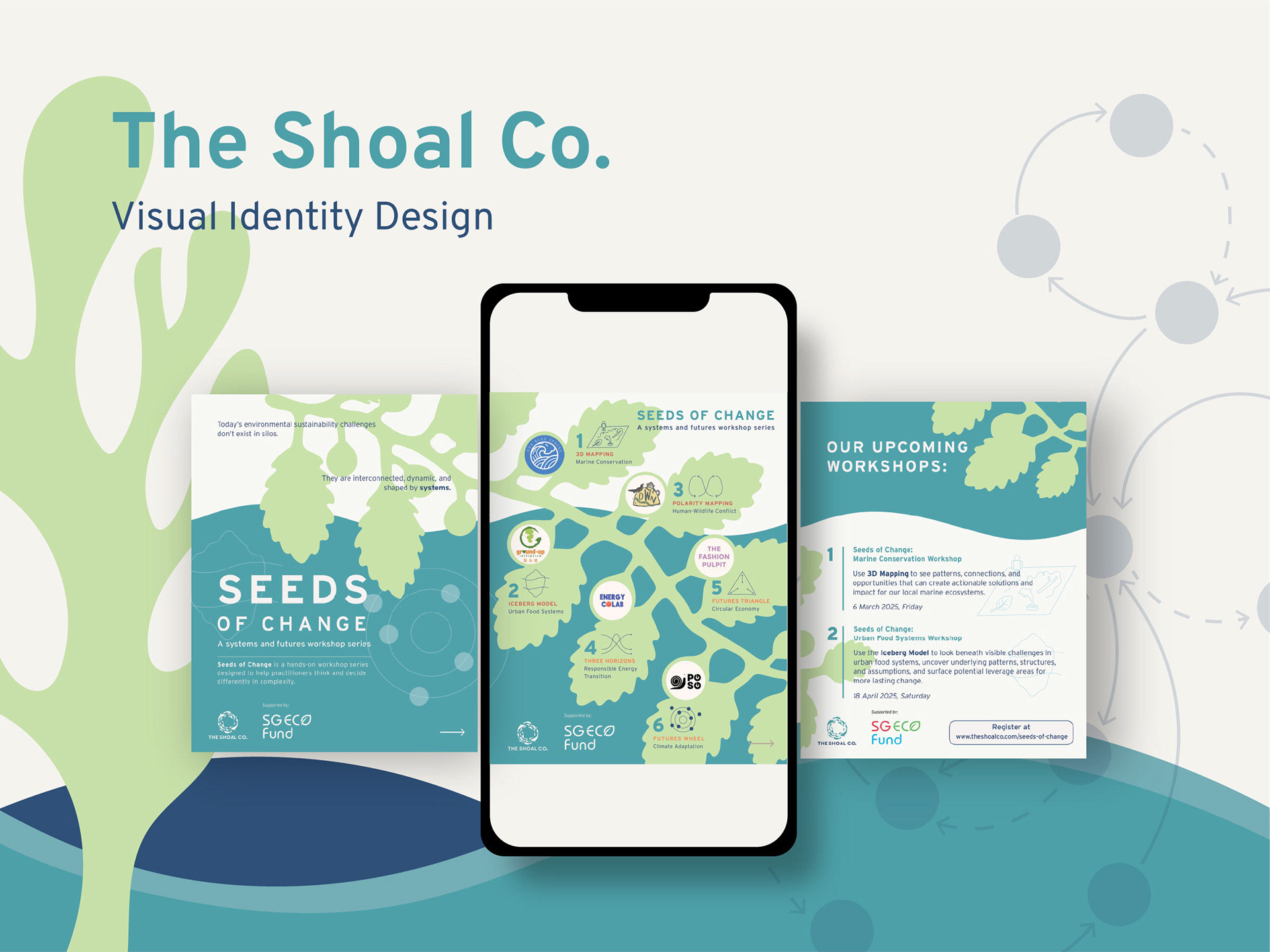
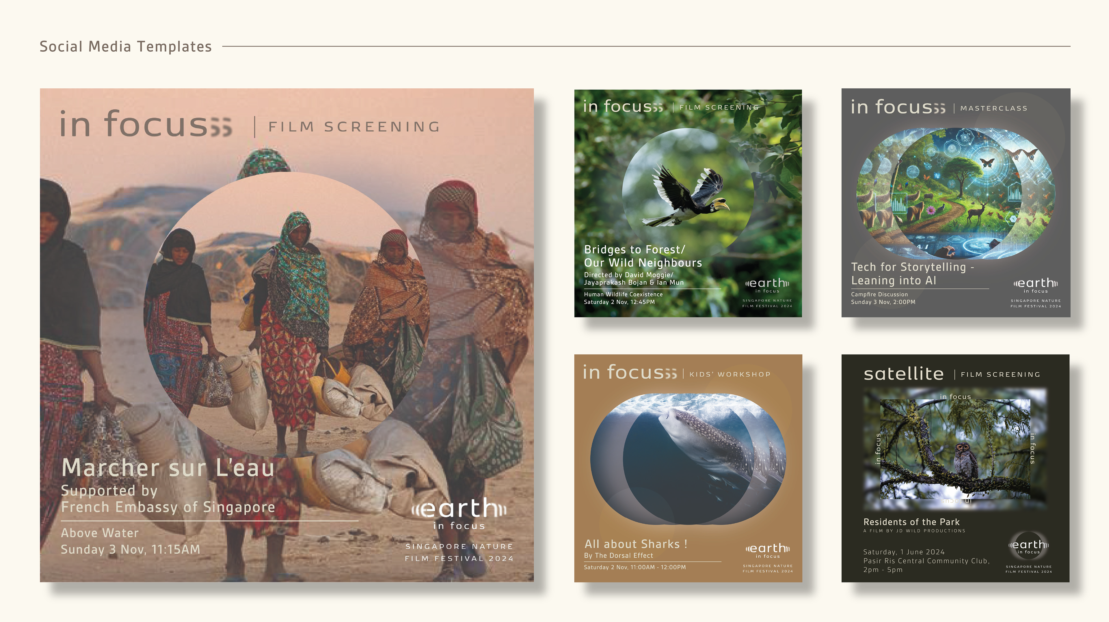
LOGO AND VISUAL IDENTITY DESIGN
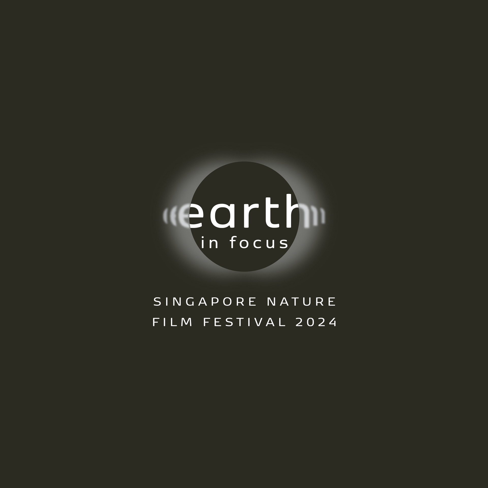
Earth in Focus, Singapore Nature Film Festival
DATE
May 2024
ROLE
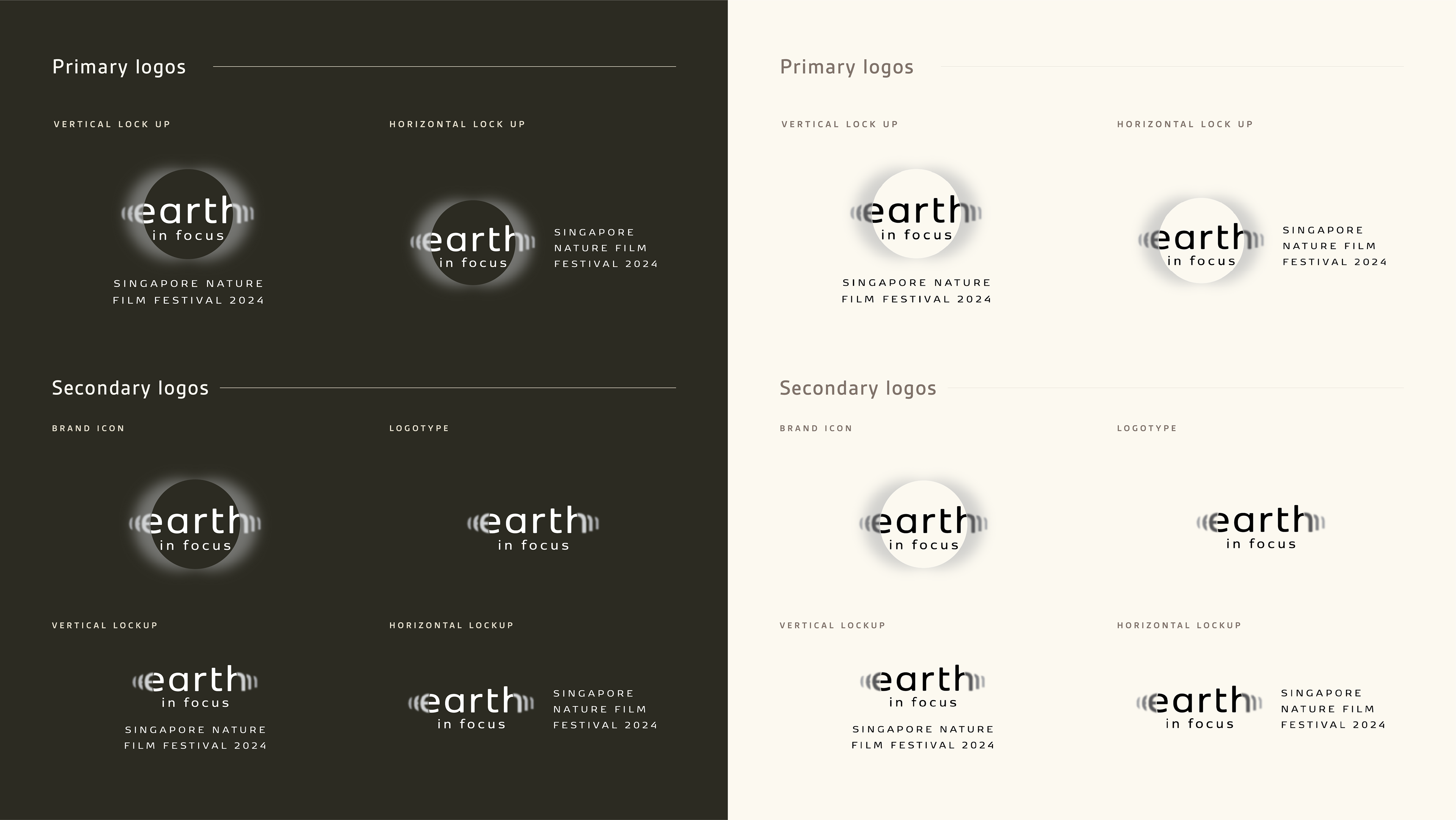
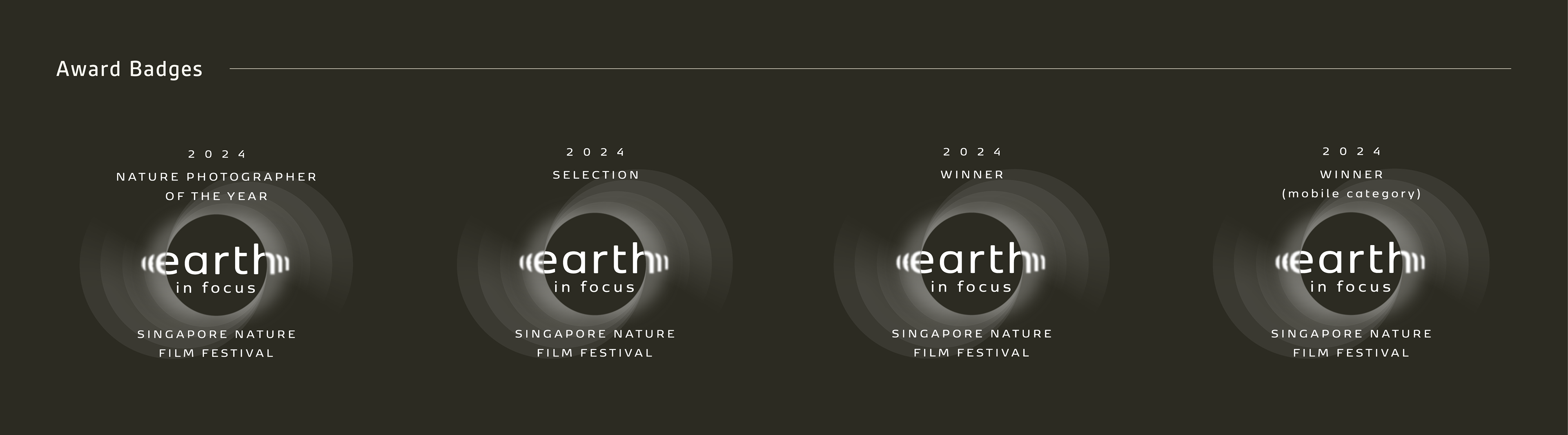
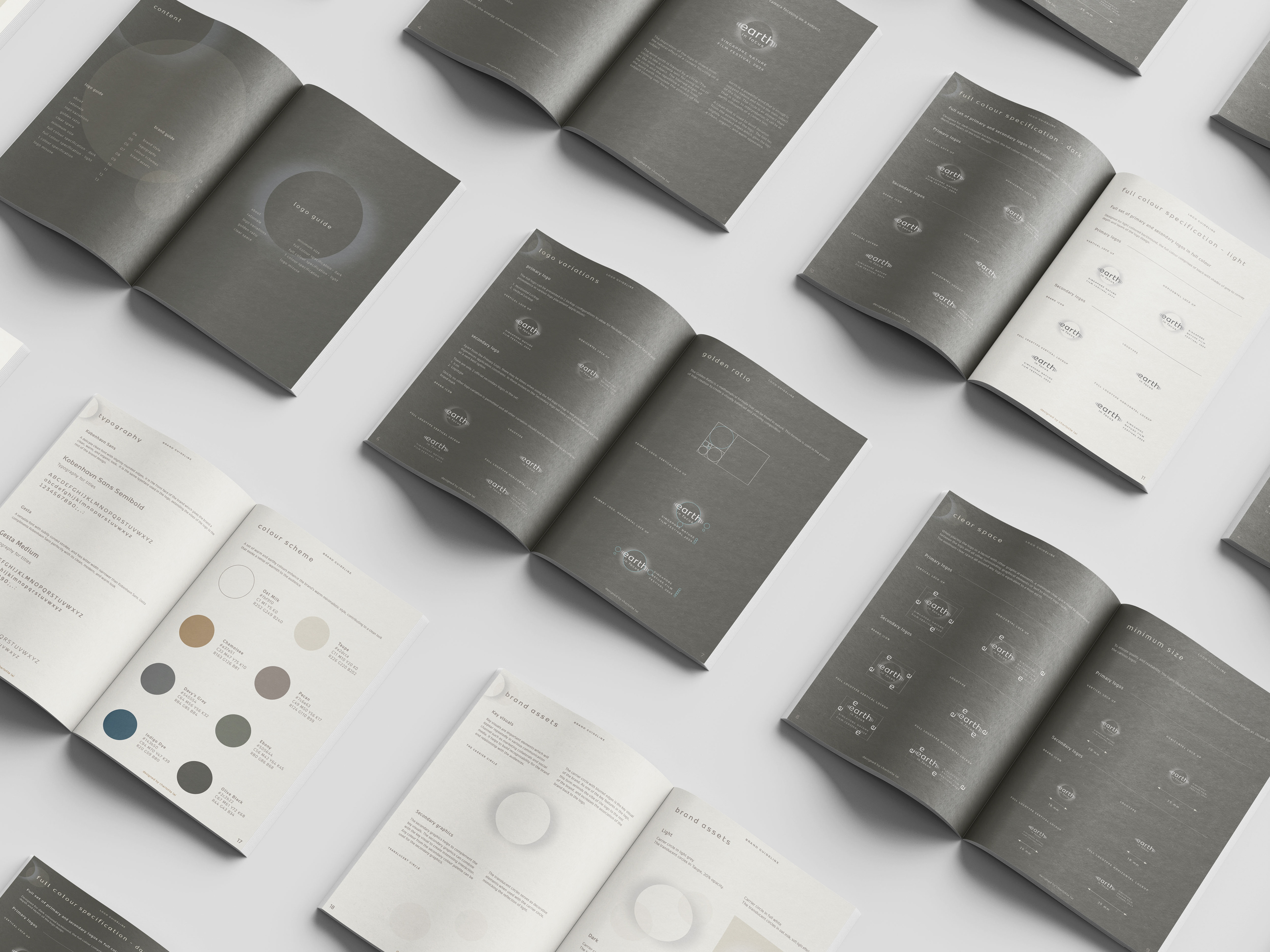
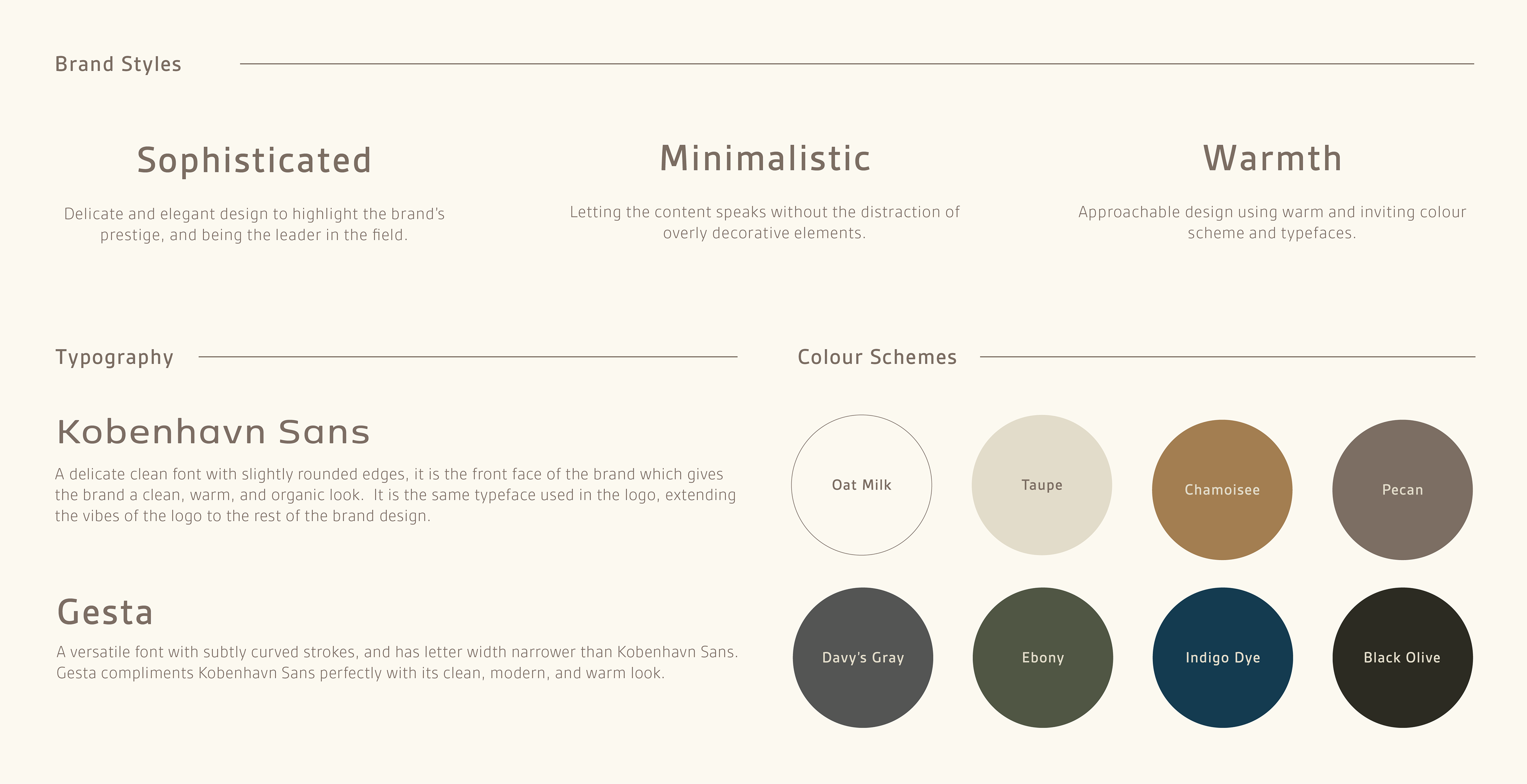
Creative direction, brand audit, logo design, colour palette , graphic assets creation, font pairing, social media template design, award logo design
Earth in Focus, Singapore Nature Film Festival aims to raise awareness of the natural world through films, photography, and other related educational activities.
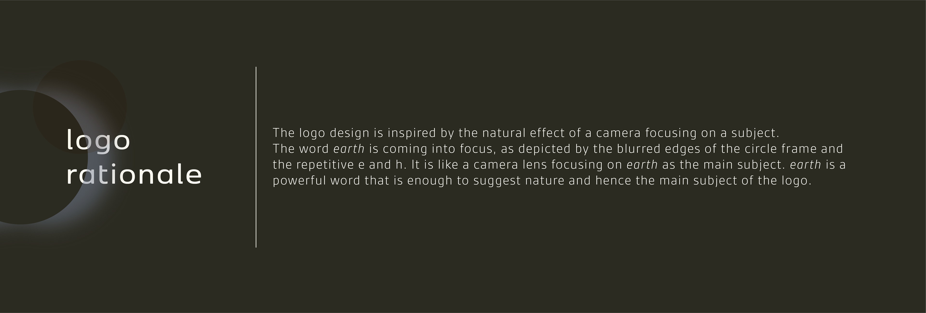
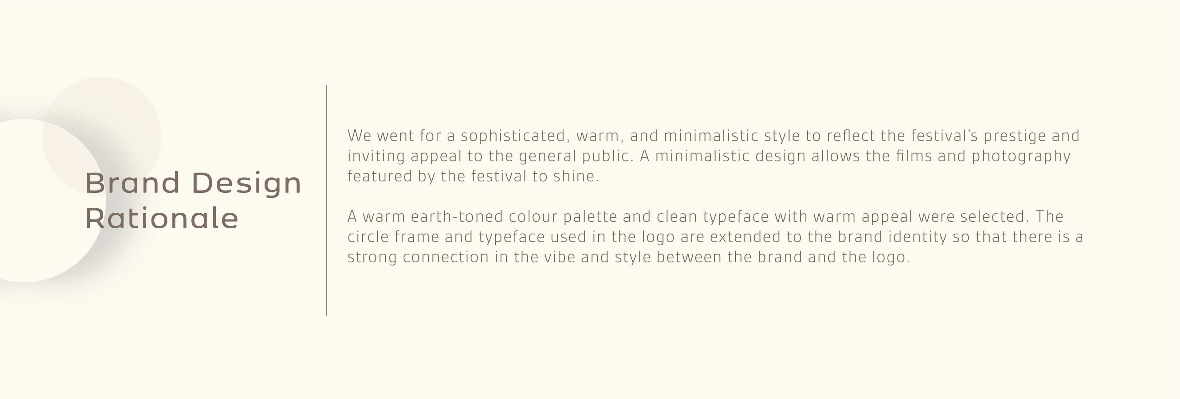
This project focuses on designing a logo and a brand identity system that embodies the energy of a prestigious nature-focused film festival and resonates with the general public.
We are honored to be the recipient of the Indigo Design Award 2026 Gold Winner in Logos for Graphic Design and Silver Winner in Branding for NGO & Non-Profit.
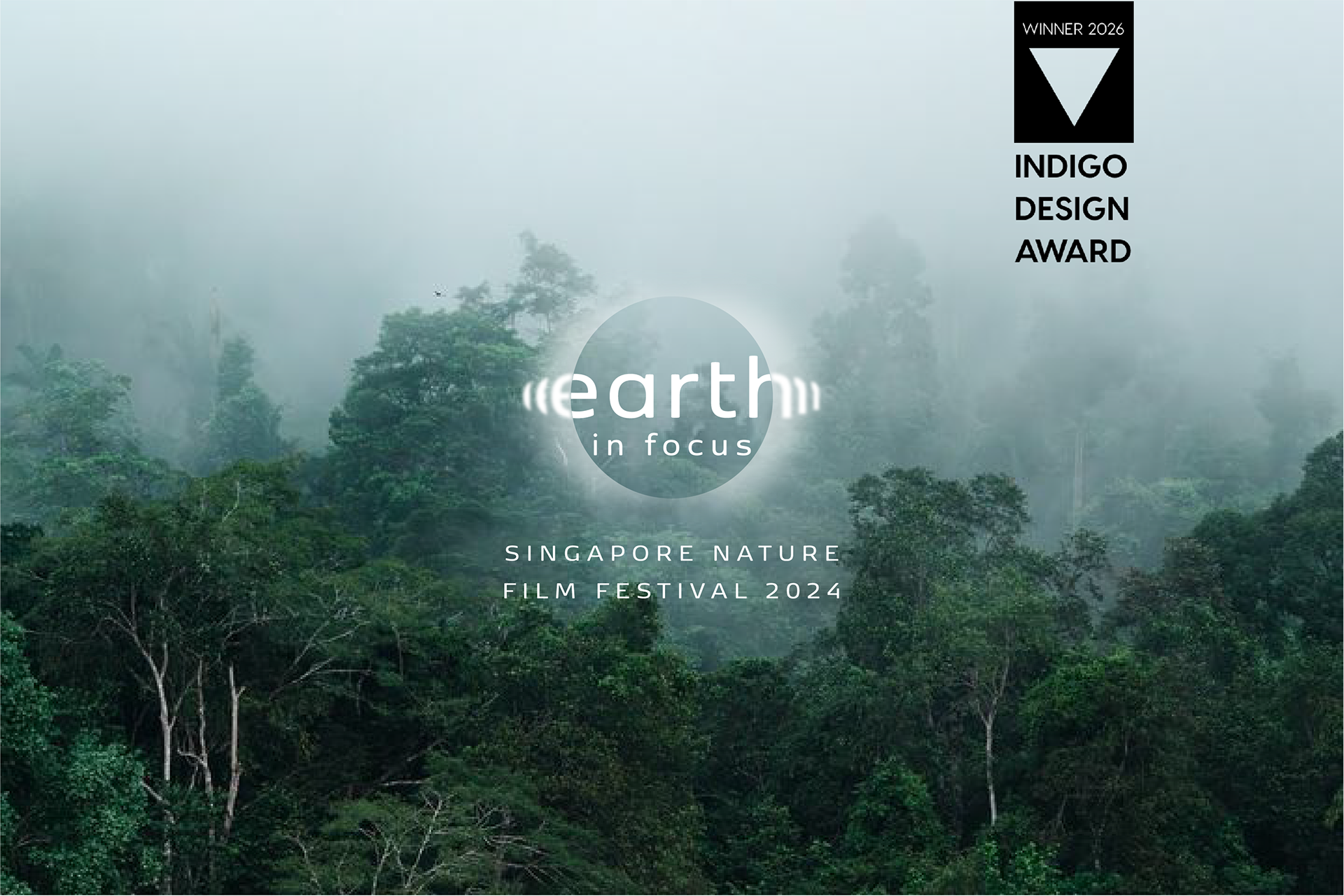
Logo design for Earth in Focus, Singapore Nature Film Festival. Photography: Roving Studio, Ian Mun.
Testimonial
Efficient, straightforward, and it was very easy to work with Charlotte!
- Daphne, founder of Wild Space
*** ***
Thank you so much for your support and doing this for us. I think the branding is really coming up nicely and the team is really happy and loving the logo that you have just made for us.
- Ian Mun, founder of The Roving Studio